How To Design Your Fantasy Book Covers
Think about the last time you were at a bookstore. What made you pick one book and walk past the other one? Let us guess: the book cover, right? Well, that pretty much sums it up. It doesn’t matter how good your book’s content is. If the cover isn’t enticing enough, people will walk past it.
Now, that holds for all books, regardless of the genre. But you might not know that designing the right cover is even more crucial for fantasy books. Why, you may wonder? It’s because the fantasy genre is tricky. There’s only so much you can do to make your book cover intriguing, but keep it from looking cliché and dated.
So, if you’ve spent countless days (and possibly nights) writing your fantasy novel, you must ensure it reaches the right audience by designing an intriguing cover and feeling lost. We have got your back. Keep reading to learn some exciting tips for creating a fantasy book cover!
Unlock The Magic Of Your Fantasy Book With These Cover Design Tips

-
Identify Your Genre
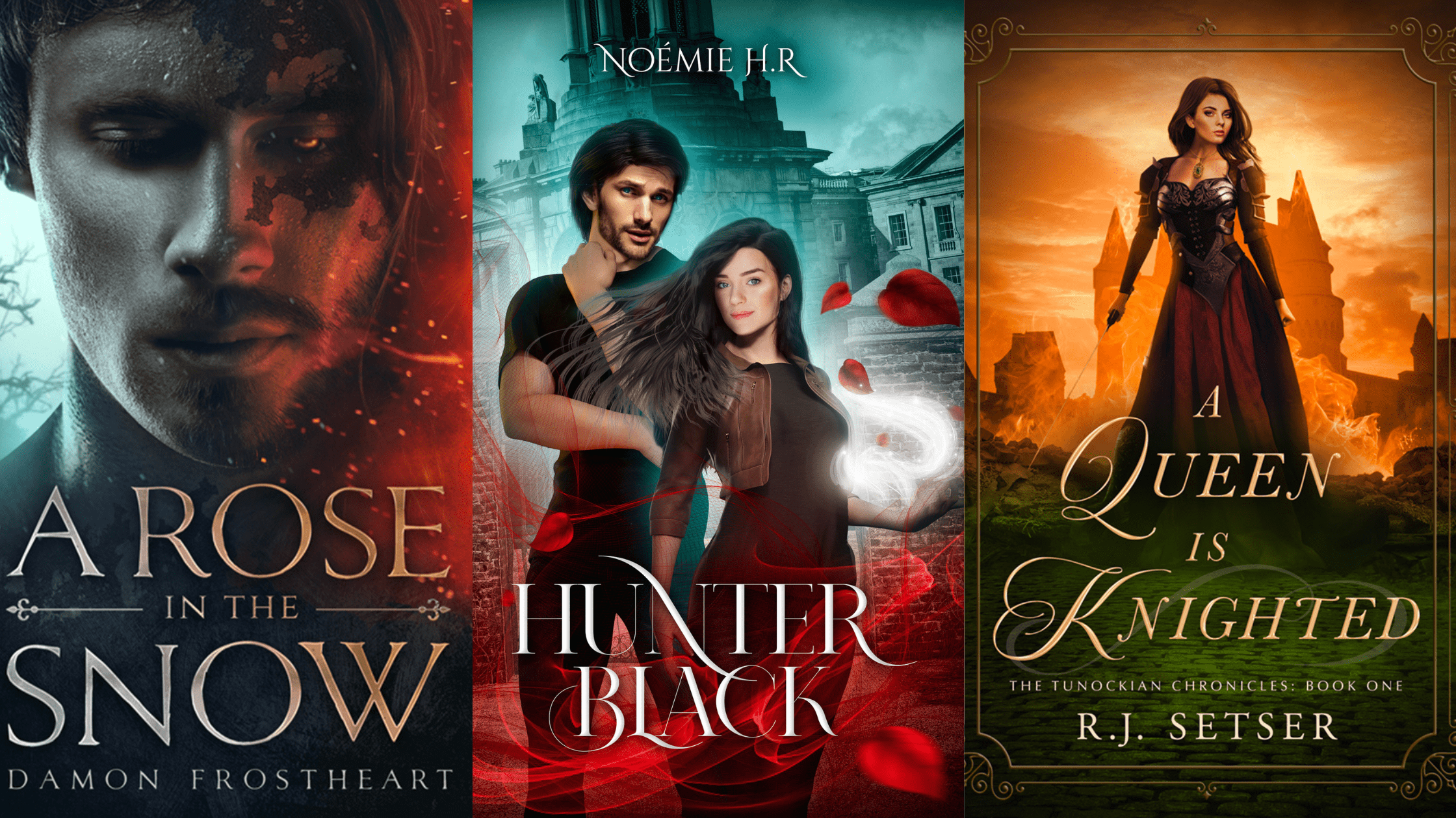
This might look silly because, duh, the genre is fantasy! But here’s the kick: fantasy is a broad category. It’s like a giant tree that has several branches. To give you a better idea, there are sub-genres like dark fantasy, historical fantasy, urban fantasy, dystopia, gothic, and magical realism.
Knowing which sub-genre your book belongs to can help you design a cover that fits the story perfectly. For example, you wouldn’t want to create a cover for your dystopian novel that shows galaxies and stardust. Even though they both relate to fantasy, that kind of cover would send the wrong message and confuse readers about what your book is really about.
-
Choose The Colour Scheme Wisely
Anyone who says that colours don’t matter knows nothing about marketing and design. For a long time, people have given colours meaning. Have you ever seen a danger sign in blue? Of course not! We associate danger with red, so that’s the colour that makes sense for those signs.
If you’re trying to create a colour scheme for your fantasy book cover designs, it’s a good idea to research colour psychology first. That way, you can ensure that the colours you choose convey the right emotions and feelings.
To get you started, here’s a handy table that shows some standard colours and the vibes they’re known for:
| Colour | Associated Vibe or Emotion |
| Purple | Mystery, Spirituality, Ambition |
| Green | Renewal, Nature, Healing |
| Blue | Peace, Loyalty, Truth |
| Orange | Confidence, Success, Bravery |
| Pink | Femininity, Gentleness, Empathy |
| Yellow | Happiness, Optimism, Friendliness |
| Black | Oppression, Bold, Dramatic |
| White | Simple, Clean, Perfection |
| Red | Love, Anger, Danger |
-
Find The Perfect Balance Between Literal and Figurative
Do you know the phrase ‘the more, the better’? That’s not the case when it comes to book covers. It’s best to tell your story with the fewest brushstrokes possible. If the cover tells too much about the book’s story, no one will be compelled to read it.
But then again, if you give away too little and tilt more on the symbolic side, there won’t be much to convince them that the book is worth their time. Hence, you have to strike a balance between literal and figurative carefully.
Here’s a golden tip to do so: try dropping subtle hints on your cover to guide readers in the right direction. Don’t yell it in their ears by steering right into the literal. Keep your representation symbolic but in a more restrained manner.
-
Pick An Appropriate Font
You might think you’re reading the words when looking at a book title, but that’s not true. Your brain processes it differently. It absorbs it like a form of art, so reading the title can set off a whole thought process. But you don’t want to go overboard with the fancy fonts because the title needs to be easy to read. Someone should be able to glance at it immediately and know what it says.
So, here’s a simple rule to follow. Stick to traditional or formal fonts if your fantasy book leans towards a severe tone. If it’s more light-hearted and humorous, opting for whimsical or playful fonts would be a better idea.
But with so many font options out there, it can be overwhelming to choose the right one. Luckily, picking a font is usually the job of a publisher or formatter. You can ask them for recommendations if you’ve hired eBook design services for your manuscript. They’ll know just what to do to make your title look great!
-
Don’t Hesitate To Against The Grain
If you’re working on a book with a similar story to one you love, it’s OK to take inspiration from it. However, copying elements from another book might not be the best idea when designing your book cover. Let us explain why.
Think about it for a moment. Do you want your book to blend in with the crowd? Certainly not! You want it to stand out and catch people’s attention. That’s why avoiding making it look too similar to other books is essential. Imagine someone seeing your book cover and thinking, “Oh, I’ve seen this before.” You don’t want that to happen, do you? You want your book to be unique and memorable.
So, what can you do? First, get to know the fantasy genre’s requirements and limitations. Once you understand what works and what doesn’t, don’t be afraid to experiment and develop something fresh and exciting. Remember, stealing the spotlight is much better than just sharing it!
Conclusion:
Remember, the key to making your book a hit is its cover. Whether you are a seasoned author or a newbie, your book cover game must be strong. These cover design tips can be a game-changer if you’re working on a fantasy novel.
So why wait? It’s time to put your new knowledge to work and create a book cover that will make everyone stop and take notice! Don’t let your book get lost in the crowd – let it shine with a killer cover!
FAQs
Q: What makes a book cover design successful?
For a book cover design to be successful, it should effectively capture the book’s essence, appeal to the right audience, and stand out from the competition.
Q: How do you make a book look good?
To make your book look good, make sure it has a visually appealing, consistent, and balanced design with elements like colour, layout, images, and typography.
Q: Should you design your book cover yourself?
Although the idea might sound appealing, considering the money it’s going to save, it may have a negative impact on your book’s potential sales. It’s best to leave the cover design to professionals.
Q: How do you find a good book cover designer?
You should check if the designer has worked on books similar to yours and see if their style matches the vibe of your book. If it does, then you’re heading in the right direction!


